Electric Art: How Wolf Trap’s In-House Creative is Lighting Up Its Summer Season
Jul 03, 2017
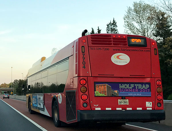
Have you noticed the new Wolf Trap artwork around the DC metro area this summer? It’s hard to miss the vibrant neon logo and bright color palette. We sat down with Wolf Trap’s Art Director, Sara Shaffer to get the scoop on how her in-house Creative team develops seasonal artwork that is fresh, eye-catching, and reflective of the energy of the artists who perform at Wolf Trap.
What is the Creative team’s process for developing a Summer artwork campaign?
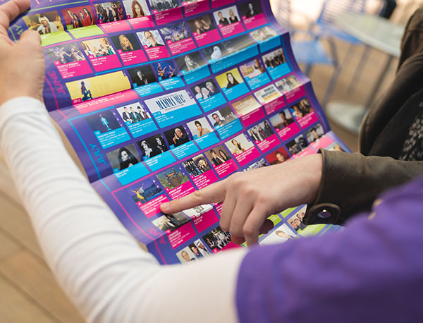
We’re always inspired by the energy onstage and among our fans. There’s a laidback, joyful and extremely energetic aspect of our summer season that always needs to be reflected in the design. Just like our season changes from year to year to keep things current, we want to keep the design fresh, while still staying true to the qualities that make Wolf Trap unique. The creative development for each Wolf Trap summer campaign begins in the fall. The in-house Creative team does research and gathers inspiration and trends. We then dedicate a full day to review our creative inspirations and brainstorm possible applications. By the end of our session, we have usually developed two to three concepts that we later refine through draft layouts, solving for how key pieces such as the season calendar, Center Lines cover, and advertising will look. From there, we utilize feedback to narrow our focus and select a final look and feel.
What inspired the Summer 2017 creative?
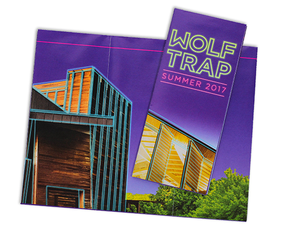
When we started concepting back in November, we were very aware of a prevalent design trend—neon. It was perfect for Wolf Trap because it was bold, a bit nostalgic, and very current. Having built equity in our new brand identity, we felt confident that we could push the branding, and so the Wolf Trap logotype transformed into glowing neon tubes. We’ve also established a new color palette that was very bright—the green, magenta, and cyan complemented our proprietary purple very well, allowing us to maintain that brand essence.
What’s your favorite part of the Summer 2017 creative?
The electricity that the neon treatment has brought to our branding! The colors really pop and grab your attention, and the neon effect gives us a great opportunity to have fun on digital formats. For example, we’re animating the logotype to “light up” the way a neon sign would on our animated banner ads and new digital park signage. This season’s design also allowed us to rethink our television spots. The dynamic palette and glowing treatment provide great energy for those videos.
How has the public response to the Summer 2017 creative been so far?
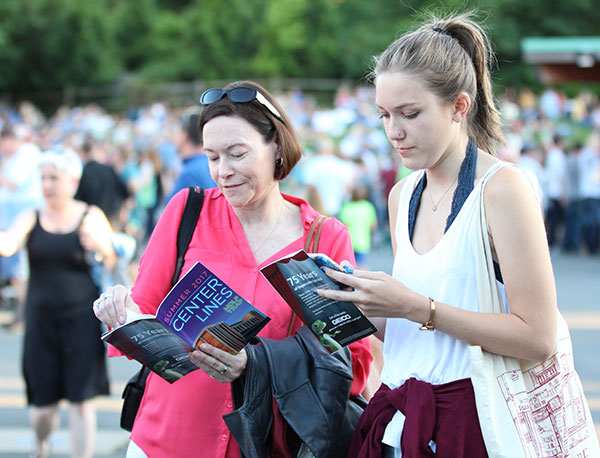
Very positive. It seems to have gotten everyone excited for summer! Every application of the campaign is reflective of the excellence and energy of the artists that perform at the Filene Center. We even see patrons taking photos of themselves against the digital signs in the Park.
Recommended Posts
Movie Magic: Behind the Scores
Jul 19, 2024 - Experience, Summer
Behind the Counter: Concessions 2024
Jul 05, 2024 - Experience, Summer